Were we supposed to memorise what attributes and options different blocks have when Gutenberg first came out? If so I slept through that class. Are they immediately intuitive to everybody else? If so, it’s just me. But every time I want a block to ever so slightly break the format I have to go hunting for a block type that has the settings options that I need because the one I start with never does and I never understand why.
So in the name of science I figured I would go about it systematically for once and get it down in print what the different standard comes-in-the-package blocks in WordPress 6.3 are capable of. Formally, the purpose is to find the perfect block for a very specific text box that I want to create but over the course of the post I hope to generally educate myself and hopefuly anyone else reading, on how different types of blocks differ.
So what exactly am I looking for? Basically, it’s the 90s word processor idea of a text box. A stand-alone block of text, typically delineated from the rest of the text by a different background, a border and/or typographic differences. Crucially, the main text body should wrap around the box on either side (if there is room) so that it integrates naturally into the flow (what LibreOffice Writer calls parallel text wrap).
(It is worth pointing out at this stage that most of what follows will only make sense when seeing the post in a desktop browser or view. Mobile browsers will just stack most side-by-side arrangements, masking any difference)
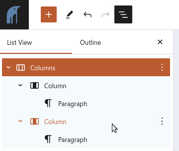
This first option here is just using simple columns. Columns work pretty much as you would assume in Gutenberg: You add a Columns (plural) block after which a wizard style UI will guide you to a basic layout. Inside of each Column block can then be added regular Paragraph blocks in order to actually write something in the columns. To add more columns (after having finished with the interactive column designer), the Columns (plural) block need to be selected. Then a slider option should appear in the sidebar.
As always, check the Document Overview/List View (Shift+Alt+O) to check that the blocks conform to what you expect.
The “hey, I just discovered word processor colouring options” features in the box above are fairly “block agnostic”, meaning that they can be added to any regular paragraph block. So any solutions that allow for inserting paragraphs inside of the text box can do special background colours, drop caps, font adjustments, etc.
As is readily apparent above, the main disadvantage of using columns for a text box is the lack of text flow. The explanatory paragraph in the right column is tied to the “text box” column and I have to start a new paragraph outside of the Columns (plural) block in order to escape it. By default (at least in my current theme) this also creates a rather large gap between columns and subsequent paragraphs (though this can obviously be counteracted both in the theme and block specific CSS).
As for dimensions, the columns option is fairly good. The Columns (plural) block makes it easy to pick width distribution between columns using the wizard UI. After creation it is also fairly easy to adjust each individual column’s width using a percentage option in the settings sidebar for each Column (singular) block, though you should be aware that the other Column blocks do not adjust automatically (i.e. try to sum all widths to 100%) . Finally, the Columns (plural) block has the full set of alignment options (including Wide width as used above, and Full width which basically means no horisontal margins). The block also allows for various vertical alignment options (top, center or bottom), i.e. in which direction content should be pulled if the columns aren’t equally tall.
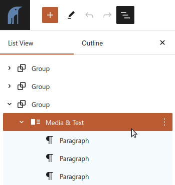
Moving on, I am going to pounce on the Media & Text block. Given the limitations of the block I think this is mostly intended as a quick fix solution for non-technical users who want to combine well, media and text. You could easily achieve much the same result using columns or rows. On the plus side, it looks nice by default without having to worry too much about spacing and alignment. The block works as sort of a combination of Columns (plural) and Column (singular) in that the image but not text is integrated into the block (i.e. you don’t have an image block inside of the block, but text is added as Paragraph blocks inside of the T&M block).
Unlike the columns option, we have a single simple way to adjust respective width, using the block’s media width slider in the settings sidebar and in the block toolbar is a simple switch for media on the left, text on the right and vice versa. However, it has the same set of alignment options as columns (here I am using Full width). And again, much like columns, I can add multiple paragraphs inside of the Media & Text block which makes for decent flexibility.
However, and I have been skirting the issue for long enough now, I haven’t really created a text box as such, unless I always want a text box accompanied by an image. Unlike the regular Image block there is no way to add text on top of the image in the Media & Text block.
And of course, I again have the issue of text flow: Adding more paragraphs in the text part of Media & Text just means that the image either keeps on expanding or is shunted to some vertical alignement end (depending on various options). Text can never flow organically outside of being next to the image.
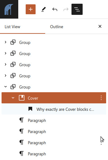
Why exactly are Cover blocks called “covers”? I mean sure, they can be used to catch the eye, combining image and text in a magazine-like fashion, but their main attraction so far seems to be their ability to integrate into the flow of text, just like word processor text boxes have done since time immemorial (or at least WordPerfect 6-ish?)
Next on the block (pun absolutely intended) is the Cover block. I have inserted one premade by Automattic from the Patterns tab and only replaced the image and colour scheme but the generic cover block works much the same. The built-in set of patterns in WordPress often help me see the potential in a block type, but I don’t actually want to use them as-is.
Covers do not “incorporate” a space for text “outside” of the pretty box but they can leave room on either side for other content, including a regular paragraph like this one. In order to do that, however, you have to pick the Align left or Align right alignment options in the alignment options on the block toolbar.
Covers can go both wide and full width (thus “breaking” the main containers) however both of those options leave no space on the sides and so push the subsequent paragraphs down below the cover, thus somewhat reducing the text box effect.
The main advantage – which should be coming up and becoming apparent any minute now, depending on browser settings – is that Cover blocks unlike the previous entries, do allow for text to wrap around the box. As mentioned above the Paragraph blocks in proximity to the Cover block are not inside of the Cover block. So there is also no big break when regular text paragraphs continue and move away from the text box.
A Cover block with a background colour instead of a background image, alignment of block is Align right, content position of block is right centre, minimum height set to 30 vh. Paragraph block with right aligned text as the only content.
Alright, but due to the magazine inspiration for the block it is born with an image in the background. What if I don’t want an image in my text box? Can I avoid that without resorting to bad hacks like fully transparent PNGs? Let’s see.
Yes, I can. When creating a Cover block from scratch I simply ignore the part of the UI that calls for an image and pick one of my theme’s default colours instead. Or duotone options for that matter. As for the text inside of the Cover block, it is simply a Paragraph block which means that I can do all the usual things with it, including text alignment, background colours etc.
If I wanted a border around my box it could be done by using the desired border colour as the Cover block background and then returning to the general blog background colour in the paragraph. Though I would probably prefer actually using CSS for that (see the Advanced section of the Block part of the Settings sidebar).
There is one thing about Cover blocks that does annoy me, though. For all their flexibility I haven’t found any width options. Left- and right alignment shrinks width from 100% of the parent element down to a CSS max-width setting of 50% but with no obvious way to adjust it. Interestingly, the full CSS rule is
.alignleft:not(.is-resized),
.alignright:not(.is-resized) {
    max-width: 50%;
}
… which seems to imply that the rule can be nullified if the div is a member of the class .is-resized. Though how one should go about that, I do not know. (All cover blocks have simple resizing handles but those only work to change the block’s height, not it’s width)
Of course, since it’s 50% of the parent element, I do at least have some options. In order to in- or decrease the width I can embed the Cover block in a Group block that itself can be set to Full or Wide width which should give me more space.
The Cover blocks actually serves the purpose fairly well. Features missing from it are adjustable percentage width and the ability to have a centered text box with text wrap on both or either side (only align left or right are options). I am however satisfied that it fulfills the basic brief. I do, however, want to explore one more option. The simple Image block does have – as previously mentioned – the option to have text written over them. Would this work just as well as Cover blocks? Let’s try it out.
So, the thing is…
As soon as you press the button to put text on top of the image, the block is transformed from an Image block to a Cover block. So not much point in exploring that any further.
Finally, I think the Details block deserves an honourable mention. While it doesn’t match the description I started out with, it can serve many of the same purposes as the text box when the information contained therein is optional and not mandatory to understanding for the reader.
There are obviously more possible avenues to explore. You can go in to the plugins section and expand your options that way. You will undoubtedly be able at some point to find a pattern named “text box” (which will incidentally be built using the same ingredients we have explored today). Or for that matter, you can do the deep dive and start coding blocks using more basic elements than are available in the block editor.
However, I think for my purposes this will do. And I hope in general the post has shed some light on the somewhat not-obvious differences between the various standard blocks in WordPress as os today (version 6.3).
Blank White Sheet of Paper and a Pen © Karolina Grabowska, Pexels license